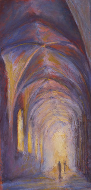
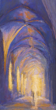
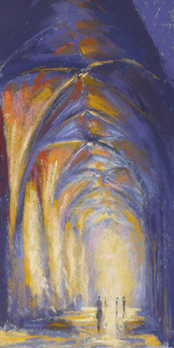
Below is the same paintings - three times.
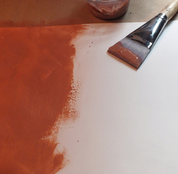
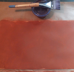
I started the first with the intention of painting on two different colored papers in order to show students the difference paper color can make. The first is painted on a rust colored paper, the second on a mid-toned blueish grey. True the pastels that were used in the two paintings were not always the same, but that is frequently driven by responding to the color of the paper and how it is interacting with the pastels. So it still drives back to the background color.
For the third version, I decided I wanted a stronger impression of light. To accomplish this I endeavored to apply the pastels stronger, bolder and looser than in the first two versions. I feel like I achieved my goal by using this technique.
 RSS Feed
